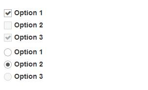
Bootstrap 3 Metro Style CSS3 Checkbox , Radio , NO JS, NO IMG
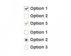
This plugin uses to add in the ticks and circles which allows far greater customization as well as scalability and ultimately much greater control over the check boxes and radios using css.
CSS
.metro-checkbox input, .metro-radio input {
position: absolute;
opacity: 0;
width: 1px;
height: 1px;
}
.metro-checkbox .check, .metro-radio .check {
background-color: #FFFFFF;
border: 1px solid #ADADAD;
display: inline-block;
height: 16px;
line-height: 11px;
margin: 0 5px 0 -20px;
padding: 0;
position: relative;
vertical-align: middle;
width: 16px;
}
.metro-radio .check {
border-radius: 100%;
}
.metro-checkbox input[type=”checkbox”]:hover ~ .check, .metro-radio input[type=”radio”]:hover ~ .check {
border-color: #A9A9A9;
}
.metro-checkbox input[type=”checkbox”]:checked ~ .check:after {
color: #333333;
content: “”;
font-family: ‘FontAwesome’;
font-size: 12px;
margin: 1px;
top: 0;
}
.metro-radio input[type=”radio”]:checked ~ .check:after {
background-color: #333;
border-radius: 100%;
content: “” !important;
display: block;
height: 10px;
margin: 3px;
width: 10px;
}
.metro-checkbox input[type=”checkbox”]:disabled ~ .check, .metro-radio input[type=”radio”]:disabled ~ .check {
opacity: 0.5;
filter: alpha(opacity=50);
cursor: not-allowed;
background-color: #EFEFEF;
}
HTML
<label class=”checkbox metro-checkbox”>
<input type=”checkbox” value=”test” checked /><span class=’check’></span>Option 1
</label>
Dependencies
1. bootstrap – www.getbootstrap.com
2. font awesome – //fortawesome.github.io/Font-Awesome/
Browsers
IE9,FireFox, Chrome
Download
- Bootstrap 3 Metro Style CSS3 Checkbox , Radio , NO JS, NO IMG - March 14, 2014