Getting Started with Twitter Bootstrap

Since Bootstrap is mobile-first framework, your design will be mobile friendly or responsive.
Get Ready to Use
Download Bootstrap from here. Extract to your project location. They have css, fonts, js folders.
Main CSS file is “bootstrap.css” that have to be included in all HTML pages. “Bootstrap-theme.css” helps in providing 3D effects to buttons and some other elements and this is optional. We have the minified versions of the css for deployment in online.
Font folder contains the font files holding various showcase icons. In the previous version, icons are represented as flat files. Font icons consume now less bandwidth, speeds up the website and so responsive and resizable.
JS folder contains bootstrap.js and the minified version of same. These files contain bootstrap’s main javascript libraries for things like carousels, drop down menus, search auto suggest etc.
Build Site
We are going to build a static landing page with bootstrap that will reveal the power of this elegant framework.
Load Assets
<!DOCTYPE html>
<html>
<head>
<title>Modern Furnitures</title>
<meta name=”viewport” content=”width=device-width, initial-scale=1.0″>
<!– Bootstrap –>
<link href=”css/bootstrap.min.css” rel=”stylesheet” media=”screen”>
</head>
<body>
<script src=”//code.jquery.com/jquery.js”></script>
<script src=”js/bootstrap.min.js”></script>
</body>
</html>
The ‘viewport meta tag’ is very important when using Bootstrap 3. Since this version is compatible to different devices like mobiles, tables, desktops, retina displays etc, you need to let the browser know that is has to scale your webpage correctly on every device. Here we have set the initial content-width to the width of the device and scaled it one time only.
Notice the bootstrap’s CSS and JS loaded for formatting the page. CSS file is self explanatory describing the purpose of style.
Structure of our Site
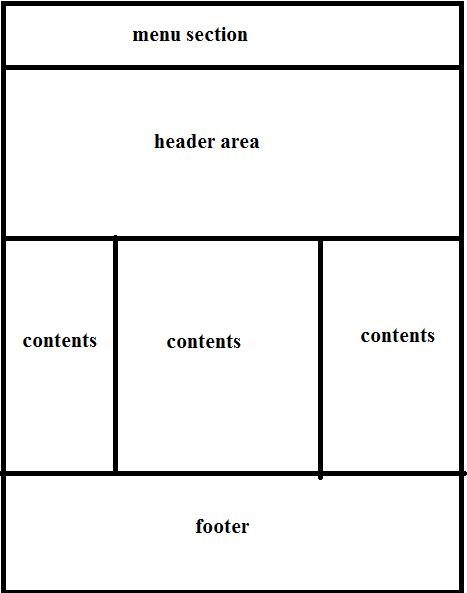
We will define the structure of our webpage by following the standard convention. The following picture explains the divide that we are going to implement in our landing page seen above.
Menu Section
Designing a menu in Bootstrap 3 is much easier one and the plus is it’s so responsive when compared to previous version. It get’s a new look in smaller devices. We have to add the correct markup and style to achieve that
<nav class=”navbar-wrapper navbar-default navbar-fixed-top” role=”navigation”></nav>
As it is html5 compatible, we can go with semantic elements and so <nav> is used.
“navbar-wrapper” – It’s the wrapper to menu
“navbar-default” – It adds background color to the menu and applies a border
“navbar-fixed-top” – It helps the menu to stay at top when page is scrolled ie sticky at top.
Moving on add some more elements to <nav> tag
<nav class="navbar-wrapper navbar-default navbar-fixed-top" role="navigation">
<div class="container">
<div class="navbar-header">
<button type="button" class="navbar-toggle" data-toggle="collapse" data-target=".navbar-ex1-collapse">
<span class="sr-only">Toggle navigation</span>
<span class="icon-bar"></span>
<span class="icon-bar"></span>
<span class="icon-bar"></span>
</button>
<a class="navbar-brand" href="#">Modern Furnitures</a>
</div>
</div>
</nav>
“container” div – It makes sure your content is aligned with a descent margin from each side of the web page.
“navbar-header” div – It’s used for branding purposes, navbar-brand in anchor display the title.
“navbar-toggle” div – It’s used for making menu responsive. It toggles by targeting the main the menu visible and hide.
Now add the following markup outside of “navbar-header”.
<div class="collapse navbar-collapse navbar-ex1-collapse">
<div class="collapse navbar-collapse">
<ul class="nav navbar-nav">
<li class="active"><a href="#"><span class="glyphicon glyphicon-home"></span> Home</a></li>
<li><a href="#"><span class="glyphicon glyphicon-star"></span> Popular</a></li>
<li class="dropdown"><a href="#" class="dropdown-toggle" data-toggle="dropdown"><span class="glyphicon glyphicon-user"></span> About Us<b class="caret"></b></a>
<ul class="dropdown-menu">
<li><a href="#">Our Company</a></li>
<li><a href="#">Contact Us</a></li>
</ul>
</li>
</ul>
<form class="navbar-form navbar-right" role="search">
<div class="form-group">
<input type="text" class="form-control" placeholder="Search">
</div>
<button type="submit" class="btn btn-default">Submit</button>
</form>
<ul class="nav navbar-nav navbar-right">
<li class="dropdown">
<a href="#" class="dropdown-toggle" data-toggle="dropdown"><span class="glyphicon glyphicon-info-sign"></span> Book Order<b class="caret"></b></a>
<ul class="dropdown-menu">
<li><a href="#">Dealer</a></li>
<li><a href="#">Customer</a></li>
</ul>
</li>
</ul>
</div>
</div>
The “navbar-collapse” div is applied to make the menu touch-compatible and also to change its form for smaller devices. We have used basic ul and li tags for listing menu items. There is a search form with class “navbar-right” to make it appear to the right of the navigation. You can refer the documentation for every other class used.
Header
Bootstrap 3 provide a most useful class named “jumbotron” that can be used to display large headers and contents. Add the following markup to achieve that.
<div class="container-fluid">
<div class="jumbotron">
<h1>Modern Furnitures</h1>
<p>Get your Requirement Shaped</p>
<a class="btn btn-primary btn-lg">Start Now!</a>
</div>
</div>
The basic difference between “container” and “container-fluid” is that former is centered to the body of the browser with a descent width while the later is set to 100% width of browser.
Contents
We have to split the area in three equal parts. Bootstrap’s twelve grid system helps to achieve this. 12 Grid System divides the screen into 12 parts and we have to specify which HTML element occupies which parts of the grid. In short any element will occupy minimum of one grid.
Consider the following markup
<div class="container">
 <div class="row">
 <div class="col-md-4">
 <a href="#"><img class="img-responsive" src="images/tile1.jpg"></a>
 <h3 class="text-center">Tile 1</h3>
<p>Lorum Ipsum</p>
 <a href="#" class="btn btn-success">Order Now ($299)</a>
</div>
 <div class="col-md-4">
 <a href="#"><img class="img-responsive img-circle" src="images/tile2.jpg"></a>
 <h3 class="text-center">Tile 2</h3>
<p>Lorum Ipsum</p>
 <a href="#" class="btn btn-danger">Order Now ($499)</a>
</div>
<div class="col-md-4">
 <a href="#"><img class="img-responsive img-circle" src="images/tile3.jpg"></a>
 <h3 class="text-center">Tile 3</h3>
<p>Lorum Ipsum</p>
 <a href="#" class="btn btn-info">Order Now ($699)</a>
</div>
</div>
</div>
The above markup contains a row with three div elements considered as columns. The row columns have class as “col-md-4”. The number tells that div/column going to occupy four grids. So the three divs occupying each four grids will form a perfect 12 Grid system.
Make sure you are specifying more than 12 grid in a row otherwise the design would break. Next the class “col-md-*” indicates that in medium sized screen devices(>992px) the siblings will be placed next to each other where as in smaller devices it will be stacked on top of one another. We also have classes for small screen(col-sm-*) and extra small screen ( col-xs-* ).
We have added some content to each column. Image has class “img-responsive” that makes it fit to the size of parent div irrespective of it’s own size and is responsive to it’s sibling div. Some title and description added on our own.
Finally a link is made to look like button with class “btn”. “btn-success” make it to look like green color.
Footer
<footer> <div class="container"> <div class="row"> <div class="col-md-4">© 2013</div> <div class="col-md-4"> <ul class="nav nav-pills"> <li class="active"><a href="#">About Us</a></li> <li><a href="#">Support</a></li> <li><a href="#">Privacy Policy</a></li> </ul> </div> <div class="col-md-4"> <h3 class="text-right">Modern Furnitures</h3> </div> </div> </div> </footer>
Here we use HTM5 footer tag with 3 cols each of 4 grid just like content area.
Custom CSS
You can also add custom CSS to the webpage. Create your own CSS file and import the bootstrap CSS into it. Define your own style by specifying the class or id. Following CSS makes you to add a background to the jumbotron element. You can place the following css in “furniture.css” and get it placed instead of “bootstrap.css”
@import url("bootstrap.min.css");
@import url("bootstrap-theme.css");
.jumbotron{
margin-top:40px;
background:url("../images/featured.jpg")topcenterno-repeat;
background-size:cover;
color:#FFF;
}
.jumbotronh1{
color:rgb(255,128,64);
text-shadow:2px2px5pxrgb(64,0,0);
}
footer{
border-top:1pxdashed#CCCCCC;
margin:40px0px;
padding:20px0px;
}
Link to the page with markup
<link href=”css/furniture.css” rel=”stylesheet” media=”screen”>
Summary
This tutorial will helps you to understand Bootstrap. The main thing you have noticed is that we have not written a single piece of CSS style and we have added only bootstrap inbuilt CSS classes and formatting handled by bootstrap css and js files.
You can get help from Bootstrap site for the all the classes name and it’s appliance.
You can download the source code here
- Late Static Binding in PHP 5.3 - July 14, 2014
- Introduction to Web Notifications API - May 10, 2014
- Manage Dependency with Composer - April 21, 2014